How to Set Three Columns in One Particular Row in CSS Grid?
Last Updated :
08 Aug, 2024
Setting up a grid layout with specific columns in CSS can sometimes be a bit challenging, especially if we are new to CSS Grid. It is a powerful tool that helps us to create complex easily. In this article, we are going to learn about different approaches to setting three columns in one particular row in the CSS grid, with their syntax and code examples.
CSS Grid is a layout system designed to make it easier to create complex web layouts. It allows us to divide our page into rows and columns. It gives us control over the size, position, and alignment of elements within the grid. One common task is setting up a row with a specific number of columns—such as three columns in one particular row—while other rows might have a different number of columns or structure.
Below are different approaches to Setting Three Columns in One Particular Row:
Using grid-template-columns for a Specific Row
The grid-template-columns property is used to define the number and size of columns in a grid. By setting it for a particular row, we can control how many columns appear and how they are sized.
Example: In this example, the grid-template-columns: repeat(3, 1fr); line creates a grid with three equal columns. The 1fr unit means "one fraction of the available space," so each column will take up an equal amount of space.
HTML
<!DOCTYPE html>
<html lang="en">

<head>
    <meta charset="UTF-8">
    <meta name="viewport"
          content="width=device-width,
                   initial-scale=1.0">
    <title>Three Columns in One Row</title>
    <style>
        .grid-container {
            display: grid;
            grid-template-columns: repeat(3, 1fr);
            gap: 10px;
        }

        .grid-item {
            background-color: lightblue;
            padding: 20px;
            text-align: center;
        }
    </style>
</head>

<body>
    <div class="grid-container">
        <div class="grid-item">Column 1</div>
        <div class="grid-item">Column 2</div>
        <div class="grid-item">Column 3</div>
    </div>
</body>

</html>
Output:
 Using grid-template-columns for a Specific Row
Using Grid Item Placement
If you want to set up three columns in just one specific row while leaving other rows with a different number of columns, you can use the grid-column property to place grid items.
Example: In this example, the first item spans all three columns, creating a full-width row. The next three items each occupy one column in the second row, setting up three columns in that particular row.
HTML
<!DOCTYPE html>
<html lang="en">

<head>
    <meta charset="UTF-8">
    <meta name="viewport" content="width=device-width, initial-scale=1.0">
    <title>Specific Row with Three Columns</title>
    <style>
        .grid-container {
            display: grid;
            grid-template-columns: 1fr 1fr 1fr;
            gap: 10px;
        }

        .grid-item:nth-child(1) {
            grid-column: span 3;
        }

        .grid-item {
            background-color: lightgreen;
            padding: 20px;
            text-align: center;
        }
    </style>
</head>

<body>
    <div class="grid-container">
        <div class="grid-item">Full Width Row</div>
        <div class="grid-item">Column 1</div>
        <div class="grid-item">Column 2</div>
        <div class="grid-item">Column 3</div>
    </div>
</body>

</html>
Output:
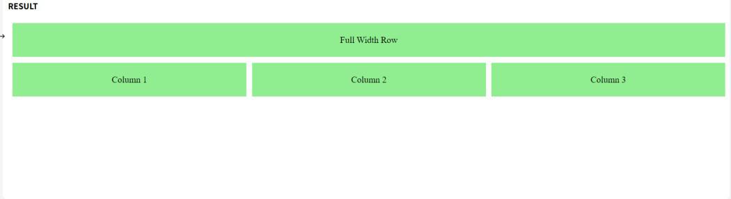 Using Grid Item Placement
Using a Combination of grid-template-areas and grid-column
You can also define specific grid areas and use them to control the layout of your grid items, which can be useful when you want more control over where items are placed.
Example: In this example, we use grid-template-areas to define the layout structure. The second row has three columns (col1, col2, col3), and other areas (header and footer) are full-width.
HTML
<!DOCTYPE html>
<html lang="en">

<head>
    <meta charset="UTF-8">
    <meta name="viewport"
          content="width=device-width,
                   initial-scale=1.0">
    <title>Grid Areas for Specific Rows</title>
    <style>
        .grid-container {
            display: grid;
            grid-template-areas:
                "header header header"
                "col1 col2 col3"
                "footer footer footer";
            gap: 10px;
        }

        .header {
            grid-area: header;
        }

        .col1 {
            grid-area: col1;
        }

        .col2 {
            grid-area: col2;
        }

        .col3 {
            grid-area: col3;
        }

        .footer {
            grid-area: footer;
        }

        .grid-item {
            background-color: lightcoral;
            padding: 20px;
            text-align: center;
        }
    </style>
</head>

<body>
    <div class="grid-container">
        <div class="grid-item header">Header</div>
        <div class="grid-item col1">Column 1</div>
        <div class="grid-item col2">Column 2</div>
        <div class="grid-item col3">Column 3</div>
        <div class="grid-item footer">Footer</div>
    </div>
</body>

</html>
Output:
 Using a Combination of grid-template-areas and grid-column
Conclusion
It is easy to set three columns in one particular row using CSS Grid. By using different properties such as grid-template-columns, grid-column, and grid-template-areas, we can create flexible and responsive layouts according to our needs.
Similar Reads
CSS Tutorial CSS stands for Cascading Style Sheets. It is a stylesheet language used to style and enhance website presentation. CSS is one of the three main components of a webpage, along with HTML and JavaScript.HTML adds Structure to a web page.JavaScript adds logic to it and CSS makes it visually appealing or
7 min read
CSS Introduction CSS (Cascading Style Sheets) is a language designed to simplify the process of making web pages presentable.It allows you to apply styles to HTML documents by prescribing colors, fonts, spacing, and positioning.The main advantages are the separation of content (in HTML) and styling (in CSS) and the
4 min read
CSS Syntax CSS is written as a rule set, which consists of a selector and a declaration block. The basic syntax of CSS is as follows:The selector is a targeted HTML element or elements to which we have to apply styling.The Declaration Block or " { } " is a block in which we write our CSS.HTML<html> <h
2 min read
CSS Selectors CSS Selectors are used to target HTML elements on your pages, allowing you to apply styles based on their ID, class, type attributes, and more. There are mainly 5 types of selectors.Basic CSS Selectors: These are used to target elements by tag, .class, or # ID for fundamental styling needs.Combinato
7 min read
CSS Comments CSS comments are used to add notes or explanations to your code, helping you and others understand it better. They start with /* and end with */ and can be used for both single-line and multi-line comments. Note: Comments are ignored by browsers, so they won’t affect how your webpage looks or works.
2 min read
CSS Colors CSS colors are used to set the color of different parts of a webpage, like text, background, and borders. This helps make the page look more attractive and easier to read. You can define colors using names, hex codes, RGB values, and more.You can try different formats of colors here- #content-iframe
5 min read
CSS Borders Borders in CSS are used to create a visible outline around an element. They can be customized in terms ofWidth: The thickness of the border.Style: The appearance of the border (solid, dashed, dotted, etc.).Color: The color of the border.You can try different types of borders here- #custom-iframe{ he
5 min read
CSS Margins CSS margins are used to create space around an element, separating it from neighboring elements and the edges of the webpage. They control the layout by adjusting the distance between elements, providing better organization and readability.Syntax:body { margin: value;}HTML<html> <head>
4 min read
CSS Height and Width Height and Width in CSS are used to set the height and width of boxes. Their values can be set using length, percentage, or auto.Width and HeightThe width and height properties in CSS are used to define the dimensions of an element. The values can be set in various units, such as pixels (px), centim
4 min read
CSS Outline CSS outline is a property used to draw a line around an element's border. It does not affect the layout, unlike borders. It's often used to highlight elements, providing a visual emphasis without altering the dimensions of the element.Syntaxselector{ outline: outline-width outline-type outline-color
4 min read