How to Create Custom Loading Button By Extending ViewClass in Android?
Last Updated :
11 Aug, 2021
In this article, we are going to create a custom loading button by extending the View class and animate properties of the custom button once it’s clicked. We had come across many times while downloading any file and keeping our eyes on the downloading progress. Here we will only create that custom button with animation. A sample GIF is given below to get an idea about what we are going to do in this article. Note that we are going to implement this project using the Kotlin language.
Step by Step Implementation
Step 1: Create a New Project
To create a new project in Android Studio please refer to How to Create/Start a New Project in Android Studio. Note that select Kotlin as the programming language.
Step 2: Create a Sealed class, ButtonState which describes the state (like clicked, loading & completed) of the custom button. Below is the code for the ButtonState.kt file.
Kotlin
package com.gfg.article.customloadingbutton

// describes the state of the custom button
sealed class ButtonState() {
    object Clicked : ButtonState()   // when button is clicked for downloading
    object Loading : ButtonState()   // when downloading is in progress
    object Completed : ButtonState() // when downloading is finished
}
Step 3: Create another class, LoadingButton in which everything related to the button like color, text, animation, etc will be defined. Make a constructor by annotating it with JvmOverloads. Below is the code for the LoadingButton.kt file.
Kotlin
import android.animation.AnimatorInflater
import android.animation.ValueAnimator
import android.content.Context
import android.graphics.Canvas
import android.graphics.Color
import android.graphics.Paint
import android.graphics.Typeface
import android.util.AttributeSet
import android.view.View
import androidx.core.content.ContextCompat
import com.gfg.article.customloadingbutton.ButtonState
import kotlin.properties.Delegates

class LoadingButton @JvmOverloads constructor(

    context: Context, attrs: AttributeSet? = null, defStyleAttr: Int = 0) : View(context, attrs, defStyleAttr) {

    private var bgColor: Int = Color.BLACK
    private var textColor: Int = Color.BLACK // default color

    // tells the compiler that the value of a variable
    // must never be cached as its value may change outside
    @Volatile
    private var progress: Double = 0.0
    private var valueAnimator: ValueAnimator

    // observes the state of button
    private var buttonState: ButtonState by Delegates.observable(ButtonState.Completed) { p, old, new ->
    }

    private val updateListener = ValueAnimator.AnimatorUpdateListener {
        progress = (it.animatedValue as Float).toDouble()
        invalidate()    // redraw the screen
        requestLayout() // when rectangular progress dimension changes
    }

    // call after downloading is completed
    fun hasCompletedDownload() {
        // cancel the animation when file is downloaded
        valueAnimator.cancel()
        buttonState = ButtonState.Completed
        invalidate()
        requestLayout()
    }

    // initialize
    init {
        isClickable = true
        valueAnimator = AnimatorInflater.loadAnimator(
            context,
            // properties for downloading progress is defined
            R.animator.loading_animation
        ) as ValueAnimator

        valueAnimator.addUpdateListener(updateListener)

        // initialize custom attributes of the button
        val attr = context.theme.obtainStyledAttributes(
            attrs,
            R.styleable.LoadingButton,
            0,
            0
        )
        try {

            // button back-ground color
            bgColor = attr.getColor(
                R.styleable.LoadingButton_bgColor,
                ContextCompat.getColor(context, R.color.purple_200)
            )

            // button text color
            textColor = attr.getColor(
                R.styleable.LoadingButton_textColor,
                ContextCompat.getColor(context, R.color.white)
            )
        } finally {
            // clearing all the data associated with attribute
            attr.recycle()
        }
    }

    // set attributes of paint
    private val paint = Paint(Paint.ANTI_ALIAS_FLAG).apply {
        style = Paint.Style.FILL
        textAlign = Paint.Align.CENTER // button text alignment
        textSize = 55.0f //button text size
        typeface = Typeface.create("", Typeface.BOLD) // button text's font style
    }

    override fun performClick(): Boolean {
        super.performClick()
        if (buttonState == ButtonState.Completed) buttonState = ButtonState.Loading
        animation()

        return true
    }

    // start the animation when button is clicked
    private fun animation() {
        valueAnimator.start()
    }

    override fun onDraw(canvas: Canvas) {
        super.onDraw(canvas)
        paint.strokeWidth = 0f
        paint.color = bgColor
        // draw custom button
        canvas.drawRect(0f, 0f, width.toFloat(), height.toFloat(), paint)

        // to show rectangular progress on custom button while file is downloading
        if (buttonState == ButtonState.Loading) {
            paint.color = Color.parseColor("#004349")
            canvas.drawRect(
                0f, 0f,
                (width * (progress / 100)).toFloat(), height.toFloat(), paint
            )
        }
        // check the button state
        val buttonText = if (buttonState == ButtonState.Loading)
            resources.getString(R.string.loading)  // We are loading as button text
        else resources.getString(R.string.download)// download as button text

        // write the text on custom button
        paint.color = textColor
        canvas.drawText(buttonText, (width / 2).toFloat(), ((height + 30) / 2).toFloat(), paint)
    }

}
Step 4: Working with the XML file
Navigate to the app > res > layout > activity_main.xml and add the below code to that file. Below is the code for the activity_main.xml file.
XML
<?xml version="1.0" encoding="utf-8"?>
<androidx.constraintlayout.widget.ConstraintLayout
    xmlns:android="http://schemas.android.com/apk/res/android"
    xmlns:app="http://schemas.android.com/apk/res-auto"
    xmlns:tools="http://schemas.android.com/tools"
    android:layout_width="match_parent"
    android:layout_height="match_parent"
    tools:context=".MainActivity">

    <!--Custom Button-->
    <com.example.customloadingbutton.LoadingButton
        android:id="@+id/custom_button"
        android:layout_width="0dp"
        android:layout_height="60dp"
        android:layout_marginStart="10dp"
        android:layout_marginTop="100dp"
        android:layout_marginEnd="10dp"
        android:layout_marginBottom="100dp"
        app:layout_constraintBottom_toBottomOf="parent"
        app:layout_constraintEnd_toEndOf="parent"
        app:layout_constraintStart_toStartOf="parent"
        app:layout_constraintTop_toTopOf="parent"
        app:textColor="@color/white" />

</androidx.constraintlayout.widget.ConstraintLayout>
attrs.xml (under res -> values )
XML
<?xml version="1.0" encoding="utf-8"?>
<resources>
    <declare-styleable name="LoadingButton">
        <!--create custom attributes for the view-->
        <attr name="bgColor" format="integer" />
        <attr name="textColor" format="integer" />
    </declare-styleable>
</resources>
loading_animation.xml (under res -> animator, create animator directory under res)
XML
<?xml version="1.0" encoding="utf-8"?>
<animator
    xmlns:android="http://schemas.android.com/apk/res/android"
    android:duration="2000"
    android:interpolator="@android:anim/accelerate_decelerate_interpolator"
    android:valueFrom="0f"
    android:valueTo="100f"
    android:valueType="floatType" />
Step 5: Working with the MainActivity.kt file
Go to the MainActivity.kt file and refer to the following code. Below is the code for the MainActivity.kt file. Comments are added inside the code to understand the code in more detail.
Kotlin
import android.os.Bundle
import android.widget.Toast
import androidx.appcompat.app.AppCompatActivity

class MainActivity : AppCompatActivity() {

    lateinit var loadingButton: LoadingButton
    private var complete = false

    override fun onCreate(savedInstanceState: Bundle?) {
        super.onCreate(savedInstanceState)
        setContentView(R.layout.activity_main)

        loadingButton = findViewById(R.id.custom_button)

        loadingButton.setOnClickListener {
            Toast.makeText(this, "File is downloading", Toast.LENGTH_LONG).show()
            complete = true
        }

        if (complete) {
            // call when download completed
            loadingButton.hasCompletedDownload()
        }
    }
}
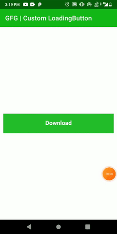
Output:
Source Code: Link
Similar Reads
How to Create Dialog with Custom Layout in Android?
In Android, A dialog is a small window that prompts the user to make a decision, provide some additional information, and inform the user about some particular task. The following are the main purposes or goals of a dialog To warn the user about any activity.To inform the user about any activity.To
3 min read
How to create customized Buttons in Android with different shapes and colors
A Button is a user interface that are used to perform some action when clicked or tapped. Default Shape of Button In this article, we will try to change the shape and color of Button to various designs, like: Oval Button Rectangular Button Cylindrical Button Approach: Below are the various steps to
4 min read
How to Create Buttons Inside a Widget in Android?
PrerequisitesHow to Create a Basic Widget of an Android App?How to Create a Dynamic Widget of an Android App?A Widget is a mini version of an Application, that provides a ground for the user to navigate through it or use its features from the Home Screen or Lock Screen. Widgets contain elements acco
4 min read
How to Create Blink Effect on TextView in Android?
In this article, we are going to implement a very important feature related to TextView. Here we are adding the blink text feature on a TextView. This feature can be used to show important announcements or notifications in an App. Even we can add this feature to show important links for the user. So
2 min read
Auto-Hide or Auto-Extend Floating Action Button in RecyclerView in Android
In the article Auto-Hide or Auto-Extend Floating Action Button for NestedScrollView in Android it's been discussed and demonstrated how to auto-extend or hide the Floating Action Button in the Nested Scroll View. In this article, it's discussed how to Hide or Extend the Floating Action Button in And
7 min read
How to Change Colors of a Floating Action Button in Android?
Android applications use the Floating Action Button for prompting the user to perform some important action within the android application. Floating Action Buttons in android applications are used to perform some important functionality within android applications. Many times in the android applicat
3 min read
How to Generate Dynamic Multiple Buttons in Android?
In Android Studio, buttons are graphical user interface (GUI) elements that users can click or tap to perform an action. Buttons are typically represented by a rectangular or rounded rectangular shape with a label or an icon. In this article, we will learn to make dynamic multiple buttons in android
2 min read
Create Custom Intro Slider of an Android App with Kotlin
IntroSlider is seen in many android applications to display the introduction of the different screens within our application. This intro slider will display information about different features within the android application. In this article, we will take a look at How to Create a Custom Intro Slide
8 min read
Create Floating Animation for RecyclerView Items in Android
In Android, a RecyclerView is a UI element that is used to display a type of layout items in the form of a list. This list is scrollable and each element of the list is clickable. You can find more information on creating RecyclerView in this article: RecyclerView in Android with Example. RecyclerVi
5 min read
How to Change Background Image by Button Clicking Event in Android?
Background Images play an important role in the beautification of any application. Hence, most social media applications like WhatsApp, Messenger provides this as a part of their feature to their users. So, keeping this in mind we will be going to develop an android application in which background i
3 min read