How to Get divs to Fill up 100% of the Container Width without Wrapping in CSS Flexbox?
Last Updated :
08 Aug, 2024
Creating a layout where <<div>> elements fill the full width of their container without wrapping can be a little complex in web design. CSS flexbox makes this easier by allowing us to control the alignment and sizing of elements. In this article, we are going to discuss how to use Flexbox to achieve this layout.
Flexbox is a powerful CSS layout module designed to align and distribute space among items in a container. One of its functions is managing the width of elements in a way that prevents them from wrapping onto a new line. If we need multiple <<div>> elements to span the full width of their container and stay in a single row, we can use Flexbox.
Below are different approaches to make sure that our <div> elements stretch to fill the container's width without wrapping:
Using Flexbox with flex-grow Property
The flex-grow property allows flex items to grow and fill up the remaining space in the container. By setting this property, we ensure that all flex items take up equal space within the container.
Syntax:
.container {
  display: flex;
}
.item {
  flex-grow: 1;
}
Example: In this example, the <<div>> elements inside the container will stretch to fill the entire width of the container equally, with no wrapping.
HTML
<!DOCTYPE html>
<html lang="en">

<head>
    <meta charset="UTF-8">
    <meta name="viewport"
          content="width=device-width,
                   initial-scale=1.0">
    <title>Flexbox Example</title>
    <style>
        .container {
            display: flex;
        }

        .item {
            flex-grow: 1;
            background-color: lightblue;
            margin: 5px;
            padding: 10px;
            text-align: center;
        }
    </style>
</head>

<body>
    <div class="container">
        <div class="item">Item 1</div>
        <div class="item">Item 2</div>
        <div class="item">Item 3</div>
    </div>
</body>

</html>
Output:
 Using Flexbox with flex-grow Property
Using Flexbox with flex Property
The flex shorthand property can be used to set flex-grow, flex-shrink, and flex-basis in one line. This is another way to make sure that items occupy the full width of the container without wrapping.
Syntax:
.container {
  display: flex;
}
.item {
  flex: 1;
}
Example: In this example, each item will equally share the container’s width, stretching to fill the space and remaining in a single row.
HTML
<!DOCTYPE html>
<html lang="en">

<head>
    <meta charset="UTF-8">
    <meta name="viewport"
          content="width=device-width,
                   initial-scale=1.0">
    <title>Flexbox Example</title>
    <style>
        .container {
            display: flex;
        }

        .item {
            flex: 1;
            background-color: lightgreen;
            margin: 5px;
            padding: 10px;
            text-align: center;
        }
    </style>
</head>

<body>
    <div class="container">
        <div class="item">Item A</div>
        <div class="item">Item B</div>
        <div class="item">Item C</div>
    </div>
</body>

</html>
Output:
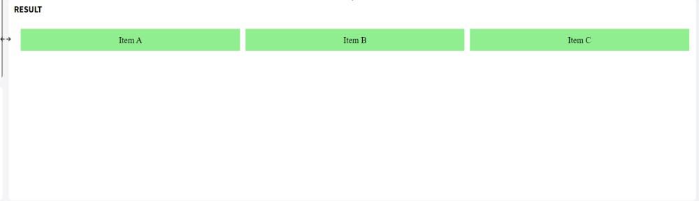 Using Flexbox with flex Property
Using Flexbox with flex-basis Property
The flex-basis property defines the initial size of a flex item before any space distribution happens. By setting flex-basis to 0, we ensure that the items can stretch to fill the available space.
Syntax:
.container {
  display: flex;
}
.item {
  flex-basis: 0;
  flex-grow: 1;
}
Example: Each <<div>> will expand to fill the container’s width, evenly distributing the space and staying on the same line.
HTML
<!DOCTYPE html>
<html lang="en">

<head>
    <meta charset="UTF-8">
    <meta name="viewport"
          content="width=device-width,
                   initial-scale=1.0">
    <title>Flexbox Example</title>
    <style>
        .container {
            display: flex;
        }

        .item {
            flex-basis: 0;
            flex-grow: 1;
            background-color: lightcoral;
            margin: 5px;
            padding: 10px;
            text-align: center;
        }
    </style>
</head>

<body>
    <div class="container">
        <div class="item">Box X</div>
        <div class="item">Box Y</div>
        <div class="item">Box Z</div>
    </div>
</body>

</html>
Output:
 Using Flexbox with flex-basis Property
Conclusion
We can use CSS Flexbox to get <<div>> elements to fill 100% of the container width without wrapping, this is a simple and efficient method. By using properties such as flex-grow, flex, and flex-basis, we can control the layout of our items easily.
Similar Reads
How to wrap an element with more content in flexbox container to have the same width as other elements in CSS ?
In a flexbox container, we might have a scenario where you want to wrap an element with more content, such as text or an image, to have the same width as other elements. In this article, we will see how to wrap an element with more content in a flexbox container to have the same width as other eleme
3 min read
How to align item to the flex-end in the container using CSS ?
Aligning items to the flex-end in a container using CSS helps create visually appealing layouts by ensuring content is positioned at the end of the container. To align items to the flex-end within a container using CSS, apply the justify-items: flex-end; property to the container. This shifts items
3 min read
How to Set a Fixed Width Column with CSS Flexbox ?
When working with CSS flexbox, setting a fixed width for a column can be achieved by using various approaches to override the default behavior of flex items, which typically grow and shrink to fill available space. Table of Content Using the flex propertyUsing the min-width and max-width propertiesC
4 min read
How to Fix Justify-content Property Not Working in CSS Flexbox?
The CSS Flexbox is a powerful layout module that allows for the efficient alignment and distribution of the space among items in a container. One of its core properties justify-content is used to align flex items along the main axis. However, there are instances where the justify-content property mi
6 min read
How to stretch flexbox to fill the entire container in Bootstrap?
We are given an HTML document (linked with Bootstrap) with a flexbox and a container. The goal is to stretch the flexbox to fill the entire container. Table of Content Using Bootstrap flex-fill classUsing Bootstrap's flex-grow ClassUsing Bootstrap flex-fill classThe .flex-fill class stretches the wi
3 min read
How to Set a Flex Container to Match the Width of Its Flex Items?
Flexbox is a powerful layout model in CSS that simplifies the process of designing responsive layouts. One common scenario is needing the flex container to dynamically adjust its width to match the combined width of its flex items. By default, flex containers expand to fill the available space, but
2 min read
How to Specify an Element After which to Wrap in CSS Flexbox?
Flexbox is a powerful CSS layout tool that helps create flexible and responsive designs easily. One of its features is the ability to control the wrapping of items within a flex container. In this article, we are going to learn how to specify an element after which the wrapping should occur in a CSS
3 min read
How to give a div tag 100% height of the browser window using CSS
CSS allows to adjustment of the height of an element using the height property. While there are several units to specify the height of an element. Set the height of a <div> to 100% of its parent container with height: 100%, or use height: 100vh; for a full viewport height, ensuring the <div
2 min read
How to make Flexbox Children 100% Height of their Parent using CSS?
Flexbox is an incredibly useful tool for creating responsive layouts and distributing space evenly among child elements. When you want flexbox child elements to take up the full height of their parent container.1. Using Flexbox and Height PropertyWe can use the display: flex property to create a fle
2 min read
How to make div width expand with its content using CSS ?
Given an HTML document and the task is to make div width expand with its content using CSS. To do this, the width property is used to set the width of an element excluding padding, margin and border of element. The width property values are listed below:Syntax:width: length|percentage|auto|initial|i
3 min read