How to Make a Square Plot With Equal Axes in Matplotlib?
Last Updated :
09 Jan, 2024
In this article, we are going to discuss how to illustrate a square plot with an equal axis using the matplotlib module. We can depict a Square plot using matplotlib.axes.Axes.set_aspect() and matplotlib.pyplot.axis() methods.
Make a Square Plot With Equal Axes in Matplotlib
There are various ways to draw a square in Python using matplotlib. here we are explaining there are some methods with the help of that method we can draw a square in Python using matplotlib those are following.
Using set_aspect() Method
Syntax: matplotlib.axes.Axes.set_aspect()
Parameters:
- aspect : This parameter accepts the following value {'auto', 'equal'} or num.
- adjustable : This defines which parameter will be adjusted to meet the required aspect.
- anchor : This parameter is used to define where the Axes will be drawn if there is extra space due to aspect constraints.
- share: This parameter is used to apply the settings to all shared Axes.
Basic Matplotlib Square Plot
Example 1: We can generate a square plot using matplotlib.axes.Axes.set_aspect() method. We will assign equal as an aspect argument and box as an adjustable argument.
In this example, code uses NumPy and Matplotlib to create a simple plot. It generates a list of coordinates, creates a plot, and ensures the plot is a square by setting equal aspect ratios before displaying it.
Python3
# import required module
# import required modules
import numpy as np
import matplotlib.pyplot as plt

# adjust coordinates
x = y = [i for i in range(0, 6)]

# depict illustration
fig = plt.figure()
ax = fig.add_subplot()
plt.plot(x, y)

# square plot
ax.set_aspect('equal', adjustable='box')
plt.show()
Output:

Example 2: The above example possibly yields a square plot when ranges for the two tomahawks are set to be the equivalent. To produce a square plot in the overall case, we need to physically set the viewpoint proportion utilizing the accompanying order:
axes.set_aspect(1./axes.get_data_ratio())
In this example the code uses NumPy and Matplotlib to create a simple plot with adjusted coordinates. It generates a list of coordinates, creates a square plot, and then displays the illustration. Note: The aspect ratio adjustment is updated in the "square plot" section.
Python3
# import required modules
import numpy as np
import matplotlib.pyplot as plt

# adjust coordinates
x = y = [i for i in range(0, 6)]

# depict illustration
fig = plt.figure()
ax = fig.add_subplot()
plt.plot(x, y)

# square plot
ax.set_aspect(1.0/ax.get_data_ratio(), adjustable='box')
plt.show()
Output:
Using axis() Method
Syntax: matplotlib.pyplot.axis()
Parameters:
- xmin, xmax, ymin, ymax:These parameters can be used to set the axis limits on the graph.
- emit:Its a bool value used to notify observers of the axis limit change.
Basic Matplotlib Square Plot
Example 1: In this example, we pass square as an argument to matplotlib.pyplot.axis(), it illustrates a square plot. The code utilizes NumPy and Matplotlib to create a basic plot with adjusted coordinates. It generates a list of coordinates, plots them, ensures the plot is a square, and then displays the illustration.
Python3
# import required module
# import required modules
import numpy as np
import matplotlib.pyplot as plt

# adjust coordinates
x=y=[i for i in range(0,6)]

# plot coordinates
plt.plot(x,y)

# square plot
plt.axis('square')

# depict illustration
plt.show()
Output:
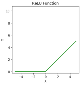
Example 2: Here is another example to illustrate a square plot using axis() method. In this example code utilizes Matplotlib to visualize the Rectified Linear Unit (ReLU) function. It defines x and computes corresponding y values using ReLU activation. The resulting plot is a square, and it includes axis labels, a green-colored plot, and a title indicating the ReLU function.
Python3
# importing module
import matplotlib.pyplot as plt

# assigning x and y coordinates
x = [-5, -4, -3, -2, -1, 0, 1, 2, 3, 4, 5]
y = []

for i in range(len(x)):
    y.append(max(0, x[i]))

# depicting the visualization
plt.plot(x, y, color='green')
plt.xlabel('X')
plt.ylabel('Y')

# square plot
plt.axis('square')

# displaying the title
plt.title('ReLU Function')
Output:
Using add_patch() Method
Syntax : add_patch(p: matplotlib.patches.Patch) -> None
Parameters:
- p: `p` parameter is a `Patch` object (e.g., `Rectangle`, `Circle`) added to the Matplotlib Axes.
Return :
None: The method doesn't return anything
Basic Matplotlib Square Plot
Example 1: In this example code uses Matplotlib to create a square plot with an orange-outlined square using `add_patch()` method. The plot's x and y-axis limits are set, and the aspect ratio is fixed to ensure the square appears as a square. The resulting plot is titled "Square Plot with add_patch()" and displayed.
Python3
import matplotlib.pyplot as plt
import matplotlib.patches as patches

#Square plot with add_patch()
fig, ax = plt.subplots()
square = patches.Rectangle((0, 0), 1, 1, edgecolor='orange', facecolor='none')
ax.add_patch(square)
plt.xlim(-0.5, 1.5)
plt.ylim(-0.5, 1.5)
plt.gca().set_aspect('equal', adjustable='box')  # Ensures equal aspect ratio
plt.title('Square Plot with add_patch()')
plt.show()
Output:

Example 2: In this example code utilizes Matplotlib to generate a rectangular plot with a purple-outlined rectangle using `add_patch()`. The x and y-axis limits are defined to accommodate the rectangle's shape, and the aspect ratio is fixed for an accurate representation. The resulting plot is titled "Square Plot with add_patch() - Different Scales" and displayed.
Python3
import matplotlib.pyplot as plt
import matplotlib.patches as patches

#Square plot with add_patch() and different scales
fig, ax = plt.subplots()
square = patches.Rectangle((0, 0), 1, 2, edgecolor='purple', facecolor='none')
ax.add_patch(square)
plt.xlim(-0.5, 1.5)
plt.ylim(-0.5, 2.5)
plt.gca().set_aspect('equal', adjustable='box')  # Ensures equal aspect ratio
plt.title('Square Plot with add_patch() - Different Scales')
plt.show()
Output:

Similar Reads
How to add a legend to a scatter plot in Matplotlib ?
Adding a legend to a scatter plot in Matplotlib means providing clear labels that describe what each group of points represents. For example, if your scatter plot shows two datasets, adding a legend will display labels for each dataset, helping viewers interpret the plot correctly. We will explore s
2 min read
How to Add Axes to a Figure in Matplotlib with Python?
Matplotlib is a library in Python used to create figures and provide tools for customizing it. It allows plotting different types of data, geometrical figures. In this article, we will see how to add axes to a figure in matplotlib. We can add axes to a figure in matplotlib by passing a list argument
2 min read
How to Add an Average Line to Plot in Matplotlib
In this article, we will learn how we can add an average line to a plot in matplotlib. We will discuss the steps to add a horizontal average line using the axhline function, as well as the steps to add a vertical average line using the axvline function in Matplotlib. Throughout the article, we will
5 min read
How to plot a dashed line in matplotlib?
Matplotlib is used to create visualizations and plotting dashed lines is used to enhance the style and readability of graphs. A dashed line can represent trends, relationships or boundaries in data. Below we will explore how to plot and customize dashed lines using Matplotlib. To plot dashed line:Sy
2 min read
How to put the y-axis in logarithmic scale with Matplotlib ?
In graphs, a logarithmic scale helps when numbers grow very fast, like 10, 100, 1000, and so on. Normally, in a graph, numbers increase by the same amount (like 1, 2, 3...), but in a logarithmic scale, they increase by multiplying (like 10, 100, 1000...). This makes it easier to see patterns in real
3 min read
How to Change the Line Width of a Graph Plot in Matplotlib with Python?
Prerequisite : Matplotlib In this article we will learn how to Change the Line Width of a Graph Plot in Matplotlib with Python. For that one must be familiar with the given concepts: Matplotlib : Matplotlib is a tremendous visualization library in Python for 2D plots of arrays. Matplotlib may be a
2 min read
How to Create Subplots in Matplotlib with Python?
Matplotlib is a widely used data visualization library in Python that provides powerful tools for creating a variety of plots. One of the most useful features of Matplotlib is its ability to create multiple subplots within a single figure using the plt.subplots() method. This allows users to display
6 min read
How to Change the Figure Size with Subplots in Matplotlib
Matplotlib is a powerful plotting library in Python that allows users to create a wide variety of static, animated, and interactive plots. One common requirement when creating plots is to adjust the figure size, especially when dealing with subplots. This article will guide you through the process o
4 min read
How to Plot Logarithmic Axes in Matplotlib?
Logarithmic axes help visualize data that spans several orders of magnitude by scaling the axes logarithmically instead of linearly. In Matplotlib, you can easily set logarithmic scales for the x-axis, y-axis, or both using simple methods. Let’s explore straightforward ways to apply logarithmic scal
2 min read
How to Connect Scatterplot Points With Line in Matplotlib?
Prerequisite: Scatterplot using Seaborn in Python Scatterplot can be used with several semantic groupings which can help to understand well in a graph. They can plot two-dimensional graphics that can be enhanced by mapping up to three additional variables while using the semantics of hue, size, and
2 min read