How to Set Three Columns in One Particular Row in CSS Grid?
Last Updated :
08 Aug, 2024
Setting up a grid layout with specific columns in CSS can sometimes be a bit challenging, especially if we are new to CSS Grid. It is a powerful tool that helps us to create complex easily. In this article, we are going to learn about different approaches to setting three columns in one particular row in the CSS grid, with their syntax and code examples.
CSS Grid is a layout system designed to make it easier to create complex web layouts. It allows us to divide our page into rows and columns. It gives us control over the size, position, and alignment of elements within the grid. One common task is setting up a row with a specific number of columns—such as three columns in one particular row—while other rows might have a different number of columns or structure.
Below are different approaches to Setting Three Columns in One Particular Row:
Using grid-template-columns for a Specific Row
The grid-template-columns property is used to define the number and size of columns in a grid. By setting it for a particular row, we can control how many columns appear and how they are sized.
Example: In this example, the grid-template-columns: repeat(3, 1fr); line creates a grid with three equal columns. The 1fr unit means "one fraction of the available space," so each column will take up an equal amount of space.
HTML
<!DOCTYPE html>
<html lang="en">

<head>
    <meta charset="UTF-8">
    <meta name="viewport"
          content="width=device-width,
                   initial-scale=1.0">
    <title>Three Columns in One Row</title>
    <style>
        .grid-container {
            display: grid;
            grid-template-columns: repeat(3, 1fr);
            gap: 10px;
        }

        .grid-item {
            background-color: lightblue;
            padding: 20px;
            text-align: center;
        }
    </style>
</head>

<body>
    <div class="grid-container">
        <div class="grid-item">Column 1</div>
        <div class="grid-item">Column 2</div>
        <div class="grid-item">Column 3</div>
    </div>
</body>

</html>
Output:
 Using grid-template-columns for a Specific Row
Using Grid Item Placement
If you want to set up three columns in just one specific row while leaving other rows with a different number of columns, you can use the grid-column property to place grid items.
Example: In this example, the first item spans all three columns, creating a full-width row. The next three items each occupy one column in the second row, setting up three columns in that particular row.
HTML
<!DOCTYPE html>
<html lang="en">

<head>
    <meta charset="UTF-8">
    <meta name="viewport" content="width=device-width, initial-scale=1.0">
    <title>Specific Row with Three Columns</title>
    <style>
        .grid-container {
            display: grid;
            grid-template-columns: 1fr 1fr 1fr;
            gap: 10px;
        }

        .grid-item:nth-child(1) {
            grid-column: span 3;
        }

        .grid-item {
            background-color: lightgreen;
            padding: 20px;
            text-align: center;
        }
    </style>
</head>

<body>
    <div class="grid-container">
        <div class="grid-item">Full Width Row</div>
        <div class="grid-item">Column 1</div>
        <div class="grid-item">Column 2</div>
        <div class="grid-item">Column 3</div>
    </div>
</body>

</html>
Output:
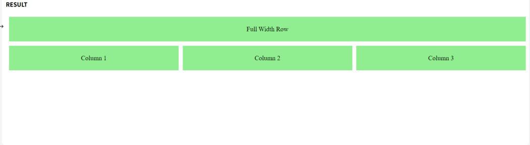 Using Grid Item Placement
Using a Combination of grid-template-areas and grid-column
You can also define specific grid areas and use them to control the layout of your grid items, which can be useful when you want more control over where items are placed.
Example: In this example, we use grid-template-areas to define the layout structure. The second row has three columns (col1, col2, col3), and other areas (header and footer) are full-width.
HTML
<!DOCTYPE html>
<html lang="en">

<head>
    <meta charset="UTF-8">
    <meta name="viewport"
          content="width=device-width,
                   initial-scale=1.0">
    <title>Grid Areas for Specific Rows</title>
    <style>
        .grid-container {
            display: grid;
            grid-template-areas:
                "header header header"
                "col1 col2 col3"
                "footer footer footer";
            gap: 10px;
        }

        .header {
            grid-area: header;
        }

        .col1 {
            grid-area: col1;
        }

        .col2 {
            grid-area: col2;
        }

        .col3 {
            grid-area: col3;
        }

        .footer {
            grid-area: footer;
        }

        .grid-item {
            background-color: lightcoral;
            padding: 20px;
            text-align: center;
        }
    </style>
</head>

<body>
    <div class="grid-container">
        <div class="grid-item header">Header</div>
        <div class="grid-item col1">Column 1</div>
        <div class="grid-item col2">Column 2</div>
        <div class="grid-item col3">Column 3</div>
        <div class="grid-item footer">Footer</div>
    </div>
</body>

</html>
Output:
 Using a Combination of grid-template-areas and grid-column
Conclusion
It is easy to set three columns in one particular row using CSS Grid. By using different properties such as grid-template-columns, grid-column, and grid-template-areas, we can create flexible and responsive layouts according to our needs.
Similar Reads
How to Display Three Columns Per Row in CSS Flexbox?
CSS Flexbox is a one-dimensional layout model that allows items within a container to be arranged in rows or columns with dynamic sizing and alignment. It simplifies the process of creating complex layouts and responsive designs. In this article we will explore approach to arrange columns in a conta
2 min read
How to specify the optimal width for the columns in CSS ?
In this article, we will learn to specify the optimal width for the columns in CSS. The column-width property of CSS is used to specify the optimal width for the columns. Approach: We can specify the optimal width for the columns in CSS using the column-width property. We set a value for the column
2 min read
How to Add Rows & Columns on hover in CSS ?
Adding rows and columns on hover in CSS allows you to dynamically expand a grid layout when a user hovers over it. This can be visually appealing and useful for displaying additional information or options. We can use the below approaches to Add Rows and Columns on hover in CSS: Table of Content Usi
3 min read
How to set length to set the gap between the columns in CSS ?
In this article, we will learn how to set the length that will set the gap between the columns. A web page's text content can be organized into many columns using CSS, which is a strong tool for web development. Long paragraphs of text can be divided into smaller, easier-to-read sections by using co
3 min read
How to Divide Text Into Two Columns Layout using CSS ?
Dividing text into two-column layouts using CSS allows for a more structured and visually appealing content presentation. It helps break long text into manageable sections, improving readability and user experience. By using CSS techniques, you can easily create balanced and organized multi-column d
4 min read
How to Align Columns in Nested HTML using CSS Grid?
We can easily Align columns in nested HTML structures using a CSS grid. There are different approaches to do this such as Simple Nested Grid Alignment, Aligning Nested Grids with Specific Columns, and Responsive Nested Grids. Each approach serves different design needs, from basic grid layouts to mo
4 min read
Tailwind CSS Grid Template Columns
This class accepts more than one value in tailwind CSS all the properties are covered as in class form. It is the alternative of CSS grid-template-columns property in CSS. It is used to set the number of columns and size of the columns of the grid, here we will do the same but for fast development o
2 min read
How to Create Columns with the Same Height in Tailwind CSS ?
Creating columns of equal height is a common design requirement in web development. This need arises in scenarios like displaying a grid of cards or a list of items where each column should have the same height regardless of its content. Tailwind CSS, a utility-first CSS framework, provides several
2 min read
How to fix the width of columns in the table ?
Fixing the width of columns in a table involves setting a specific width for each column to maintain consistent sizing. This can be achieved using CSS properties like width on <th> or <td> elements, or using the <colgroup> and <col> tags to control column widths.Syntax<td
3 min read
How to align objects vertically when working with grids in CSS ?
CSS grid layout is one of the strongest layout of CSS. The grid layout is 2-D which means it can handle both rows and columns, unlike flexbox which is 1-D. To align objects apply CSS to the parent element which becomes the grid container and the element's child which becomes the items in the grid. A
2 min read