Matplotlib Step-by-Step Guide
Last Updated :
24 Feb, 2025
Visualizing data helps us understand and share information more effectively. In Python Matplotlib is one of the best tools for creating visualizations. It’s powerful, flexible and lets you make many types of plots, from simple line charts to advanced animations. This guide will help you step by step through using Matplotlib.
Setting Up Matplotlib
Before using Matplotlib, ensure you have it installed. We can install it using pip:
pip install matplotlib
Once installed, we can import it into your Python script:
import matplotlib.pyplot as plt
Essential Role of Pyplot in Matplotlib
Pyplot is a submodule of the Matplotlib library in Python providing a beginner-friendly tool for creating visualizations with minimal code. It helps transform dull data into engaging and interactive plots, making it easier to analyze and draw meaningful insights for informed decision-making.
Syntax:
matplotlib.pyplot.plot()
For more detailed information about Matplotlib Pyplot please refer to: Matplotlib Pyplot
Creating Different Types of Plots
In data visualization, creating various types of plots is essential for effectively conveying insights from data. Below, we'll explore how to create different types of plots using Matplotlib. Each type of plot in Matplotlib is designed to address specific analytical scenarios, making them valueable tools for businesses looking for getting insights for better decision making in the industry.
1. Line Graph
Line graphs are commonly used to visualize trends over time or relationships between variables. We'll learn how to create visually appealing line graphs to represent such data.
Example
Python
import matplotlib.pyplot as plt
x = [3, 1, 3]
y = [3, 2, 1]

plt.plot(x, y)
plt.title("Line Chart")

plt.legend(["Line"])
plt.show()
Output:

Simply using plt.plot helped us to create an chart.
2. Bar chart
A bar plot or bar chart is a graph that represents the category of data with rectangular bars with lengths and heights that is proportional to the values which they represent. The bar plots can be plotted horizontally or vertically. A bar chart describes the comparisons between the discrete categories. It can be created using the bar() method.
Example:
Python
import matplotlib.pyplot as plt
x = [3, 1, 3, 12, 2, 4, 4]
y = [3, 2, 1, 4, 5, 6, 7]

plt.bar(x, y)

plt.title("Bar Chart")

plt.legend(["bar"])
plt.show()
Output:

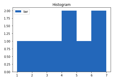
3. Plotting Histogram
Histogram is basically used to represent data in the form of some groups. It is a type of bar plot where the X-axis represents the bin ranges while the Y-axis gives information about frequency. To create a histogram the first step is to create a bin of the ranges, then distribute the whole range of the values into a series of intervals and count the values which fall into each of the intervals. Bins are clearly identified as consecutive, non-overlapping intervals of variables.
Example
Python
import matplotlib.pyplot as plt
x = [1, 2, 3, 4, 5, 6, 7, 4]

plt.hist(x, bins = [1, 2, 3, 4, 5, 6, 7])

plt.title("Histogram")
plt.legend(["bar"])

plt.show()
Output:
4. Scatter Plot
Scatter plots are ideal for visualizing the relationship between two continuous variables. We'll see how scatter plots help identify patterns, correlations or clusters within data points.
Example:
Python
import matplotlib.pyplot as plt

x = [3, 1, 3, 12, 2, 4, 4]
y = [3, 2, 1, 4, 5, 6, 7]
plt.scatter(x, y)

plt.legend("A")

plt.title("Scatter chart")
plt.show()
Output:

5. Pie Chart
Pie Chart is a circular statistical plot that can display only one series of data. The area of the chart is the total percentage of the given data. The area of slices of the pie represents the percentage of the parts of the data. The slices of pie are called wedges. The area of the wedge is determined by the length of the arc of the wedge.
Python
import matplotlib.pyplot as plt
x = [1, 2, 3, 4]

e  =(0.1, 0, 0, 0)

plt.pie(x, explode = e)

plt.title("Pie chart")
plt.show()
Output:

You can explore many more plots according to the usecase.
7. Stack Plot
Stackplot is used to create stacked area plots. It is a great way to visualize the contributions of multiple categories over time or across other continuous variables. In a stackplot, the areas representing different groups are stacked on top of each other, which allows you to see both individual and cumulative data
Python
import matplotlib.pyplot as plt

days = [1, 2, 3, 4, 5]
Studying = [7, 8, 6, 11, 7]
playing = [8, 5, 7, 8, 13]

plt.stackplot(days, Studying, playing, colors =['r', 'c'])
plt.xlabel('Days')


plt.ylabel('No of Hours')

plt.title('Representation of Study and \
Playing wrt to Days')

plt.show()
Output:

8. Stem Plot
A stem plot, also known as a stem-and-leaf plot, is a type of plot used to display data along a number line. Stem plots are particularly useful for visualizing discrete data sets, where the values are represented as "stems" extending from a baseline, with data points indicated as "leaves" along the stems. let's understand the components of a typical stem plot:
- Stems: The stems represent the main values of the data and are typically drawn vertically along the y-axis.
- Leaves: The leaves correspond to the individual data points and are plotted horizontally along the stems.
- Baseline: The baseline serves as the reference line along which the stems are drawn.
Example
Python
import matplotlib.pyplot as plt
import numpy as np

x = np.linspace(0.1, 2 * np.pi, 41)
y = np.exp(np.sin(x))

plt.stem(x, y, use_line_collection = True)
plt.show()
Output:

9. Box Plot
A box plot, also known as a box-and-whisker plot, provides a visual summary of the distribution of a dataset. It represents key statistical measures such as the median, quartiles and potential outliers in a concise and intuitive manner. Box plots are particularly useful for comparing distributions across different groups or identifying anomalies in the data.
Python
import matplotlib.pyplot as plt
import numpy as np

np.random.seed(10)
data = np.random.normal(100, 20, 200)

fig = plt.figure(figsize =(10, 7))

plt.boxplot(data)

plt.show()
Output:

10. Error Plot
Error plots display the variability or uncertainty associated with each data point in a dataset. They are commonly used in scientific research, engineering and statistical analysis to visualize measurement errors, confidence intervals, standard deviations or other statistical properties of the data. By incorporating error bars into plots, we can convey not only the central tendency of the data but also the range of possible values around each point.
Python
import matplotlib.pyplot as plt
x =[1, 2, 3, 4, 5, 6, 7]
y =[1, 2, 1, 2, 1, 2, 1]

y_error = 0.2

plt.plot(x, y)

plt.errorbar(x, y,yerr = y_error,fmt ='o')
Output:

11. Violin Plot
A violin plot is a method of visualizing the distribution of numerical data and its probability density. It is similar to a box plot but provides additional insights into the data's distribution by incorporating a kernel density estimation (KDE) plot mirrored on each side. This allows for a more comprehensive understanding of the data's central tendency, spread and shape.
Python
import numpy as np
import matplotlib.pyplot as plt


uniform = np.arange(-100, 100)

normal = np.random.normal(size = 100)*30

fig, (ax1, ax2) = plt.subplots(nrows = 1, ncols = 2,
                            figsize =(9, 4),
                            sharey = True)

ax1.set_title('Uniform Distribution')
ax1.set_ylabel('Observed values')
ax1.violinplot(uniform)

ax2.set_title('Normal Distribution')
ax2.violinplot(normal)

plt.show()
Output:

3D Plots in Matplotlib
Sometimes, data visualization requires a three-dimensional perspective. We'll delve into creating 3D plots to visualize complex relationships and structures within multidimensional datasets.
Python
import matplotlib.pyplot as plt
fig = plt.figure()

ax = plt.axes(projection = '3d')
plt.show()
Output:

The above code lets the creation of a 3D plot in Matplotlib. We can create different types of 3D plots like scatter plots, contour plots, surface plots, etc. Let's create a simple 3D line plot.
Python
import matplotlib.pyplot as plt
x = [1, 2, 3, 4, 5]
y = [1, 4, 9, 16, 25]
z = [1, 8, 27, 64, 125]

fig = plt.figure()

ax = plt.axes(projection = '3d')
ax.plot3D(z, y, x)
plt.show()
Output:

Matplotlib Subplot
Subplots are smaller axes (plots) arranged within a single figure allowing users to compare data side by side or stack visualizations for better insights. plt.subplots() method provides an easy way to define the layout of subplots.
Syntax: matplotlib.pyplot.subplots(nrows=1, ncols=1)
This syntax creates a figure with nrows rows and ncols columns of subplots.
For more detailed information about Matplotlib Subplot , Refer to the Article Matplotlib subplot.
Similar Reads
matplotlib.axes.Axes.step() in Python Matplotlib is a library in Python and it is numerical - mathematical extension for NumPy library. The Axes Class contains most of the figure elements: Axis, Tick, Line2D, Text, Polygon, etc., and sets the coordinate system. And the instances of Axes supports callbacks through a callbacks attribute.
2 min read
Plot Multiple lines in Matplotlib In this article, we will learn how to plot multiple lines using matplotlib in Python. Let's discuss some concepts:Matplotlib: Matplotlib is an amazing visualization library in Python for 2D plots of arrays. Matplotlib is a multi-platform data visualization library built on NumPy arrays and designed
6 min read
Matplotlib Pyplot API Data visualization plays a key role in data science and analysis. It enables us to grasp datasets by representing them. Matplotlib, a known Python library offers a range of tools, for generating informative and visually appealing plots and charts. One outstanding feature of Matplotlib is its user-ve
4 min read
Environment Setup for Matplotlib Matplotlib is an overall package for creating static, animated, and interactive visualizations in Python. It literally opens up a whole new world of possibilities for you! Especially when it is used with Numpy or Pandas library, one can do unimaginable things. The plots give may give a new insight a
1 min read
Customizing Styles in Matplotlib Here, we'll delve into the fundamentals of Matplotlib, exploring its various classes and functionalities to help you unleash the full potential of your data visualization projects. From basic plotting techniques to advanced customization options, this guide will equip you with the knowledge needed t
12 min read
25+ Most Used Matplotlib Snippets in 2025 Matplotlib is the most popular open-source Python library applied for creating, interactive as well as animated and static visualizations. Matplotlib is one of the oldest and very versatile libraries for data visualization in Python. A wide variety of plot tools are provided by Matplotlib for users
14 min read
Difference Between Matplotlib VS Seaborn Data Visualization is the graphic representation of data. It converts a huge dataset into small graphs, thus aiding in data analysis and predictions. It is an indispensable element of data science that makes complex data more understandable and accessible. Matplotlib and Seaborn act as the backbone
3 min read
Change plot size in Matplotlib - Python Plots are an effective way of visually representing data and summarizing it beautifully. However, if not plotted efficiently it seems appears complicated. Python's Matplotlib provides several libraries for data representation. While making a plot we need to optimize its size. In this article, we wil
3 min read
Setup Matplotlib on PyCharm Matplotlib is an effective Python library for producing static, animated, and interactive visualizations in a variety of forms. For data analysis, scientific study, and various other uses, it offers a flexible and effective approach to constructing plots, charts, and graphs. It is built on NumPy arr
5 min read
matplotlib.pyplot.figure() in Python Matplotlib is a library in Python and it is numerical - mathematical extension for NumPy library. Pyplot is a state-based interface to a Matplotlib module which provides a MATLAB-like interface. There are various plots which can be used in Pyplot are Line Plot, Contour, Histogram, Scatter, 3D Plot,
2 min read