Plot 2-D Histogram in Python using Matplotlib
Last Updated :
28 Mar, 2023
2D Histogram is used to analyse the relationship among two data variables which has wide range of values.A 2D histogram is very similar like 1D histogram.The class intervals of the data set are plotted on both x and y axis.Unlike 1D histogram, it drawn by including the total number of combinations of the values which occurs in intervals of x and y, and marking the densities.It is useful when there is a large amount of data in a discrete distribution, and simplifies it by visualizing the points where the frequencies if variables is dense.
Creating a 2D Histogram
Matplotlib library provides an inbuilt function
matplotlib.pyplot.hist2d() which is used to create 2D histogram.Below is the syntax of the function:
matplotlib.pyplot.hist2d(x, y, bins=(nx,ny), range=None, density=False, weights=None, cmin=None, cmax=None, cmap=value)
Here
(x,y) specify the coordinates of the data variables, the length of the X data and Y variables should be same.The number of bins can be specified by the attribute
bins=(nx,ny) where
nx and
ny is the number of bins to be used in the horizontal and vertical directions respectively.
cmap=value is used to set the color scale.The
range=None is an optional parameter used to set rectangular area in which data values are counted for plot.
density=value is optional parameter accepting boolean values used to normalize histogram.
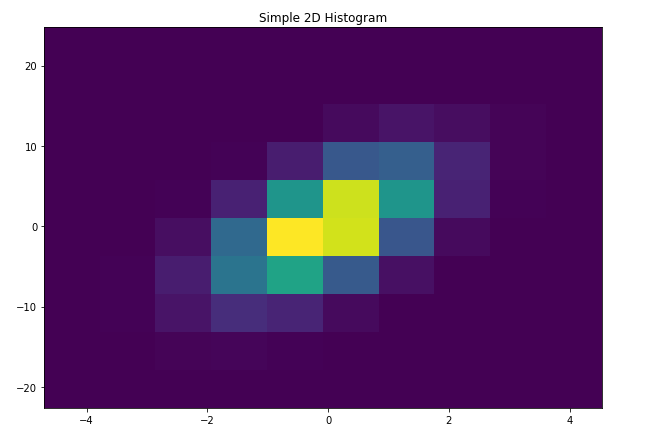
The code below code creates a simple 2D histogram using
matplotlib.pyplot.hist2d() function having some random values of x and y:
[sourcecode language="Python3"]
# Import libraries
import numpy as np
import matplotlib.pyplot as plt
import random
# Creating dataset
n = 100
x = np.random.standard_normal(n)
y = 3.0 * x
fig = plt.subplots(figsize=(10,7))
# Creating plot
plot.hist2d(x, y)
plot.title("Simple 2D Histogram")
# show plot
plot.show()
[/sourcecode]
Output:

Customizing 2D Histogram
The
matplotlib.pyplot.hist2d() function has a wide range of methods which we can use to customize and create the plot for better view and understanding.
[sourcecode language="Python3"]
# Import libraries
import numpy as np
import matplotlib.pyplot as plt
import random
# Creating dataset
x = np.random.normal(size=500000)
y = x * 3 + 4*np.random.normal(size=500000)
fig = plt.subplots(figsize=(10,7))
# Creating plot
plot.hist2d(x, y)
plot.title("Simple 2D Histogram")
# show plot
plot.show()
[/sourcecode]
Output:
Some of the customization of the above graph are listed below:
[sourcecode language="Python3"]
# Import libraries
import numpy as np
import matplotlib.pyplot as plt
import random
# Creating dataset
x = np.random.normal(size=500000)
y = x * 3 + 4*np.random.normal(size=500000)
# Creating bins
x_min = np.min(x)
x_max = np.max(x)
y_min = np.min(y)
y_max = np.max(y)
x_bins = np.linspace(x_min,x_max,50)
y_bins = np.linspace(y_min,y_max,20)
fig,ax = plt.subplots(figsize=(10,7))
# Creating plot
plt.hist2d(x,y,bins=[x_bins,y_bins])
plt.title("Changing the bin scale")
ax.set_xlabel('X-axis')
ax.set_ylabel('X-axis')
# show plot
plt.tight_layout()
plot.show()
[/sourcecode]
Output:

Changing the color scale and adding color bar:-
[sourcecode language="Python3"]
# Import libraries
import numpy as np
import matplotlib.pyplot as plt
import random
# Creating dataset
x = np.random.normal(size=500000)
y = x * 3 + 4*np.random.normal(size=500000)
# Creating bins
x_min = np.min(x)
x_max = np.max(x)
y_min = np.min(y)
y_max = np.max(y)
x_bins = np.linspace(x_min,x_max,50)
y_bins = np.linspace(y_min,y_max,20)
fig,ax = plt.subplots(figsize=(10,7))
# Creating plot
plt.hist2d(x,y,bins=[x_bins,y_bins], cmap=plt.cm.nipy_spectral)
plt.title("Changing the color scale and adding color bar")
# Adding color bar
plt.colorbar()
ax.set_xlabel('X-axis')
ax.set_ylabel('X-axis')
# show plot
plt.tight_layout()
plot.show()
[/sourcecode]
Output:

[sourcecode language="Python3"]
# Import libraries
import numpy as np
import matplotlib.pyplot as plt
import random
# Creating dataset
x = np.random.normal(size=500000)
y = x * 3 + 4*np.random.normal(size=500000)
# Creating bins
x_min = np.min(x)
x_max = np.max(x)
y_min = np.min(y)
y_max = np.max(y)
x_bins = np.linspace(x_min,x_max,50)
y_bins = np.linspace(y_min,y_max,20)
# Creating data filter
data = np.c_[x,y]
for i in range(10000):
x_idx = random.randint(0,500000)
data[x_idx,0] = -9999
data = data[data[:,0]!=-9999]
fig,ax = plt.subplots(figsize=(10,7))
# Creating plot
plt.hist2d(data[:,0],data[:,1],bins=[x_bins,y_bins])
plt.title("Filtering data")
ax.set_xlabel('X-axis')
ax.set_ylabel('X-axis')
# show plot
plt.tight_layout()
plot.show()
[/sourcecode]
Output:

Using matplotlib hexbin function:-
[sourcecode language="Python3"]
# Import libraries
import numpy as np
import matplotlib.pyplot as plt
import random
# Creating dataset
x = np.random.normal(size=500000)
y = x * 3 + 4*np.random.normal(size=500000)
fig,ax = plt.subplots(figsize=(10,7))
# Creating plot
plt.title("Using matplotlib hexbin function")
plt.hexbin(x,y,bins=50)
ax.set_xlabel('X-axis')
ax.set_ylabel('Y-axis')
# show plot
plt.tight_layout()
plot.show()
[/sourcecode]
Output:

Similar Reads
Plotting Histogram in Python using Matplotlib Histograms are a fundamental tool in data visualization, providing a graphical representation of the distribution of data. They are particularly useful for exploring continuous data, such as numerical measurements or sensor readings. This article will guide you through the process of Plot Histogram
6 min read
Histogram using Plotly in Python Plotly is a Python library which is used to design graphs, especially interactive graphs. It can plot various graphs and charts like histogram, barplot, boxplot, spreadplot and many more. It is mainly used in data analysis as well as financial analysis. plotly is an interactive visualization library
3 min read
Matplotlib.pyplot.hist() in Python The matplotlib.pyplot.hist() function in Python is used to create histograms, which are graphical representations of data distribution. It divides the data into bins (non-overlapping intervals) and counts the frequency of values in each bin, plotting them as bars. Lets consider the data values and v
3 min read
Matplotlib.pyplot.hist2d() in Python Matplotlib is a library in Python and it is numerical - mathematical extension for NumPy library. Pyplot is a state-based interface to a Matplotlib module which provides a MATLAB-like interface. matplotlib.pyplot.hist2d() Function The hist2d() function in pyplot module of matplotlib library is used
2 min read