Plotting Bar Graph in Matplotlib from a Pandas Series
Last Updated :
29 Jul, 2024
Bar graphs are one of the most common types of data visualizations used to represent categorical data with rectangular bars. Each bar's height or length corresponds to the value it represents. In Python, the combination of Pandas and Matplotlib libraries provides a powerful toolset for creating bar graphs. This article will guide you through the process of plotting a bar graph from a Pandas Series using Matplotlib, offering practical examples and tips for customization.
Plot a Bar Graph in Matplotlib from a Pandas Series: Step-by-Step
1. Importing the Libraries
First, import the necessary libraries:
Python
import pandas as pd
import matplotlib.pyplot as plt
2. Creating a Pandas Series
A Pandas Series is a one-dimensional array with axis labels. Here’s an example of how to create a Pandas Series:
Python
data = {'Category A': 10, 'Category B': 20, 'Category C': 15, 'Category D': 25}
series = pd.Series(data)
This series contains categories as the index and corresponding values.
3. Plotting the Bar Graph
To plot the bar graph, use the plot method of the Pandas Series and specify the kind parameter as bar:
Python
series.plot(kind='bar')
plt.show()
Output:
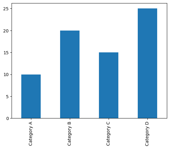 Bar Graph in Matplotlib from a Pandas Series
This will produce a simple bar graph. The plt.show() function is used to display the plot.
Customizing the Bar Graph from a Pandas Series
Matplotlib provides various customization options to enhance the appearance of your bar graph. Here are a few common customizations:
1. Adding a Title and Labels
You can add a title and labels to the x and y axes to make the graph more informative:
Python
series.plot(kind='bar')
plt.title('Sample Bar Graph')
plt.xlabel('Categories')
plt.ylabel('Values')
plt.show()
Output:
 Adding Title and Labels
2. Changing Colors
You can customize the colors of the bars using the color parameter:
Python
series.plot(kind='bar', color='skyblue')
plt.title('Sample Bar Graph with Custom Colors')
plt.xlabel('Categories')
plt.ylabel('Values')
plt.show()
Output:
 Changing Colors
3. Rotating Axis Labels
If the category labels are too long, you might want to rotate them for better readability:
Python
series.plot(kind='bar')
plt.title('Sample Bar Graph with Rotated Labels')
plt.xlabel('Categories')
plt.ylabel('Values')
plt.xticks(rotation=45)
plt.show()
Output:
 Rotating Axis Labels
Advanced Customizations for Enhanced Data Visualization
For more advanced customizations, you can directly use Matplotlib functions. For example, you can adjust the figure size, add gridlines, or customize the bar widths:
Python
plt.figure(figsize=(10, 6))
series.plot(kind='bar', color='coral', width=0.6)
plt.title('Advanced Custom Bar Graph')
plt.xlabel('Categories')
plt.ylabel('Values')
plt.xticks(rotation=30)
plt.grid(True)
plt.show()
Output:
 Advanced Customizations for Enhanced Data Visualization
Conclusion
Plotting a bar graph from a Pandas Series using Matplotlib is straightforward and offers numerous customization options to enhance the visualization. Whether you are comparing different categories or displaying frequency counts, bar graphs are an excellent choice for data visualization. By leveraging the powerful features of Pandas and Matplotlib, you can create informative and visually appealing bar graphs to effectively communicate your data insights.
Similar Reads
Different plotting using pandas and matplotlib We have different types of plots in matplotlib library which can help us to make a suitable graph as you needed. As per the given data, we can make a lot of graph and with the help of pandas, we can create a dataframe before doing plotting of data. Let's discuss the different types of plot in matplo
3 min read
How to plot a Pandas Dataframe with Matplotlib? We have a Pandas DataFrame and now we want to visualize it using Matplotlib for data visualization to understand trends, patterns and relationships in the data. In this article we will explore different ways to plot a Pandas DataFrame using Matplotlib's various charts. Before we start, ensure you ha
2 min read
How to Plot Multiple Series from a Pandas DataFrame? In this article, we will discuss how to plot multiple series from a dataframe in pandas. Series is the range of the data  that include integer points we cab plot in pandas dataframe by using plot() function Syntax: matplotlib.pyplot(dataframe['column_name']) We can place n number of series and we ha
2 min read
Plotting Sine and Cosine Graph using Matplotlib in Python Data visualization and Plotting is an essential skill that allows us to spot trends in data and outliers. With the help of plots, we can easily discover and present useful information about the data. In this article, we are going to plot a sine and cosine graph using Matplotlib in Python. Matplotlib
3 min read
How to Plot a Time Series in Matplotlib? Time series data is the data marked by some time. Each point on the graph represents a measurement of both time and quantity. Â A time-series chart is also known as a fever chart when the data are connected in chronological order by a straight line that forms a succession of peaks and troughs. x-axis
4 min read
How to visualize data from MySQL database by using Matplotlib in Python ? Prerequisites: Matplotlib in Python, MySQL While working with Python we need to work with databases, they may be of different types like MySQL, SQLite, NoSQL, etc. In this article, we will be looking forward to how to connect MySQL databases using MySQL Connector/Python. MySQL Connector module of Py
5 min read