Seaborn is a library mostly used for statistical plotting in Python. It is built on top of Matplotlib and provides beautiful default styles and color palettes to make statistical plots more attractive.
In this tutorial, we will learn about Python Seaborn from basics to advance using a huge dataset of seaborn basics, concepts, and different graphs that can be plotted.
Recent articles on Seaborn !!
Getting Started
First of all, let us install Seaborn. Seaborn can be installed using the pip. Type the below command in the terminal.
pip install seaborn
In the terminal, it will look like this -
After the installation is completed you will get a successfully installed message at the end of the terminal as shown below.
Note: Seaborn has the following dependencies -
- Python 2.7 or 3.4+
- numpy
- scipy
- pandas
- matplotlib
After the installation let us see an example of a simple plot using Seaborn. We will be plotting a simple line plot using the iris dataset. Iris dataset contains five columns such as Petal Length, Petal Width, Sepal Length, Sepal Width and Species Type. Iris is a flowering plant, the researchers have measured various features of the different iris flowers and recorded them digitally.
Example:
Python
# importing packages
import seaborn as sns
# loading dataset
data = sns.load_dataset("iris")
# draw lineplot
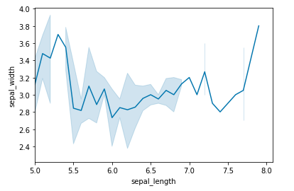
sns.lineplot(x="sepal_length", y="sepal_width", data=data)
Output:

In the above example, a simple line plot is created using the lineplot() method. Do not worry about these functions as we will be discussing them in detail in the below sections. Now after going through a simple example let us see a brief introduction about the Seaborn. Refer to the below articles to get detailed information about the same.
In the introduction, you must have read that Seaborn is built on the top of Matplotlib. It means that Seaborn can be used with Matplotlib.
Using Seaborn with Matplotlib
Using both Matplotlib and Seaborn together is a very simple process. We just have to invoke the Seaborn Plotting function as normal, and then we can use Matplotlib's customization function.
Example 1: We will be using the above example and will add the title to the plot using the Matplotlib.
Python
# importing packages
import seaborn as sns
import matplotlib.pyplot as plt

# loading dataset
data = sns.load_dataset("iris")

# draw lineplot
sns.lineplot(x="sepal_length", y="sepal_width", data=data)

# setting the title using Matplotlib
plt.title('Title using Matplotlib Function')

plt.show()
Output:

Example 2: Setting the xlim and ylim
Python
# importing packages
import seaborn as sns
import matplotlib.pyplot as plt

# loading dataset
data = sns.load_dataset("iris")

# draw lineplot
sns.lineplot(x="sepal_length", y="sepal_width", data=data)

# setting the x limit of the plot
plt.xlim(5)

plt.show()
Output:
Customizing Seaborn Plots
Seaborn comes with some customized themes and a high-level interface for customizing the looks of the graphs. Consider the above example where the default of the Seaborn is used. It still looks nice and pretty but we can customize the graph according to our own needs. So let's see the styling of plots in detail.
Changing Figure Aesthetic
set_style() method is used to set the aesthetic of the plot. It means it affects things like the color of the axes, whether the grid is active or not, or other aesthetic elements. There are five themes available in Seaborn.
- darkgrid
- whitegrid
- dark
- white
- ticks
Syntax:
set_style(style=None, rc=None)
Example: Using the dark theme
Python
# importing packages
import seaborn as sns
import matplotlib.pyplot as plt

# loading dataset
data = sns.load_dataset("iris")

# draw lineplot
sns.lineplot(x="sepal_length", y="sepal_width", data=data)

# changing the theme to dark
sns.set_style("dark")
plt.show()
Output:

Removal of Spines
Spines are the lines noting the data boundaries and connecting the axis tick marks. It can be removed using the despine() method.
Syntax:
sns.despine(left = True)
Example:
Python
# importing packages
import seaborn as sns
import matplotlib.pyplot as plt

# loading dataset
data = sns.load_dataset("iris")

# draw lineplot
sns.lineplot(x="sepal_length", y="sepal_width", data=data)

# Removing the spines
sns.despine()
plt.show()
Output:

Changing the figure Size
The figure size can be changed using the figure() method of Matplotlib. figure() method creates a new figure of the specified size passed in the figsize parameter.
Example:
Python
# importing packages
import seaborn as sns
import matplotlib.pyplot as plt

# loading dataset
data = sns.load_dataset("iris")

# changing the figure size
plt.figure(figsize = (2, 4))

# draw lineplot
sns.lineplot(x="sepal_length", y="sepal_width", data=data)

# Removing the spines
sns.despine()

plt.show()
Output:

Scaling the plots
It can be done using the set_context() method. It allows us to override default parameters. This affects things like the size of the labels, lines, and other elements of the plot, but not the overall style. The base context is “notebook”, and the other contexts are “paper”, “talk”, and “poster”. font_scale sets the font size.
Syntax:
set_context(context=None, font_scale=1, rc=None)
Example:
Python
# importing packages
import seaborn as sns
import matplotlib.pyplot as plt

# loading dataset
data = sns.load_dataset("iris")

# draw lineplot
sns.lineplot(x="sepal_length", y="sepal_width", data=data)

# Setting the scale of the plot
sns.set_context("paper")

plt.show()
Output:

Setting the Style Temporarily
axes_style() method is used to set the style temporarily. It is used along with the with statement.
Syntax:
axes_style(style=None, rc=None)
Example:
Python
# importing packages
import seaborn as sns
import matplotlib.pyplot as plt

# loading dataset
data = sns.load_dataset("iris")


def plot():
    sns.lineplot(x="sepal_length", y="sepal_width", data=data)

with sns.axes_style('darkgrid'):

    # Adding the subplot
    plt.subplot(211)
    plot()

plt.subplot(212)
plot()
Output:

Refer to the below article for detailed information about styling Seaborn Plot.
Color Palette
Colormaps are used to visualize plots effectively and easily. One might use different sorts of colormaps for different kinds of plots. color_palette() method is used to give colors to the plot. Another function palplot() is used to deal with the color palettes and plots the color palette as a horizontal array.
Example:
Python
# importing packages
import seaborn as sns
import matplotlib.pyplot as plt

# current colot palette
palette = sns.color_palette()

# plots the color palette as a
# horizontal array
sns.palplot(palette)

plt.show()
Output:

Diverging Color Palette
This type of color palette uses two different colors where each color depicts different points ranging from a common point in either direction. Consider a range of -10 to 10 so the value from -10 to 0 takes one color and values from 0 to 10 take another.
Example:
Python
# importing packages
import seaborn as sns
import matplotlib.pyplot as plt

# current colot palette
palette = sns.color_palette('PiYG', 11)

# diverging color palette
sns.palplot(palette)

plt.show()
Output:

In the above example, we have used an in-built diverging color palette which shows 11 different points of color. The color on the left shows pink color and color on the right shows green color.
Sequential Color Palette
A sequential palette is used where the distribution ranges from a lower value to a higher value. To do this add the character 's' to the color passed in the color palette.
Example:
Python
# importing packages
import seaborn as sns
import matplotlib.pyplot as plt

# current colot palette
palette = sns.color_palette('Greens', 11)

# sequential color palette
sns.palplot(palette)

plt.show()
Output:

Setting the default Color Palette
set_palette() method is used to set the default color palette for all the plots. The arguments for both color_palette() and set_palette() is same. set_palette() changes the default matplotlib parameters.
Example:
Python
# importing packages
import seaborn as sns
import matplotlib.pyplot as plt

# loading dataset
data = sns.load_dataset("iris")

def plot():
    sns.lineplot(x="sepal_length", y="sepal_width", data=data)

# setting the default color palette
sns.set_palette('vlag')
plt.subplot(211)

# plotting with the color palette
# as vlag
plot()

# setting another default color palette
sns.set_palette('Accent')
plt.subplot(212)
plot()

plt.show()
Output:

Refer to the below article to get detailed information about the color palette.
Multiple plots with Seaborn
You might have seen multiple plots in the above examples and some of you might have got confused. Don't worry we will cover multiple plots in this section. Multiple plots in Seaborn can also be created using the Matplotlib as well as Seaborn also provides some functions for the same.
Using Matplotlib
Matplotlib provides various functions for plotting subplots. Some of them are add_axes(), subplot(), and subplot2grid(). Let's see an example of each function for better understanding.
Example 1: Using add_axes() method
Python
# importing packages
import seaborn as sns
import matplotlib.pyplot as plt


# loading dataset
data = sns.load_dataset("iris")

def graph():
    sns.lineplot(x="sepal_length", y="sepal_width", data=data)

# Creating a new figure with width = 5 inches
# and height = 4 inches
fig = plt.figure(figsize =(5, 4))

# Creating first axes for the figure
ax1 = fig.add_axes([0.1, 0.1, 0.8, 0.8])

# plotting the graph
graph()

# Creating second axes for the figure
ax2 = fig.add_axes([0.5, 0.5, 0.3, 0.3])

# plotting the graph
graph()

plt.show()
Output:

Example 2: Usingsubplot() method
Python
# importing packages
import seaborn as sns
import matplotlib.pyplot as plt

# loading dataset
data = sns.load_dataset("iris")

def graph():
    sns.lineplot(x="sepal_length", y="sepal_width", data=data)

# Adding the subplot at the specified
# grid position
plt.subplot(121)
graph()

# Adding the subplot at the specified
# grid position
plt.subplot(122)
graph()

plt.show()
Output:

Example 3: Using subplot2grid() method
Python
# importing packages
import seaborn as sns
import matplotlib.pyplot as plt

# loading dataset
data = sns.load_dataset("iris")

def graph():
    sns.lineplot(x="sepal_length", y="sepal_width", data=data)

# adding the subplots
axes1 = plt.subplot2grid (
  (7, 1), (0, 0), rowspan = 2,  colspan = 1)
graph()

axes2 = plt.subplot2grid (
  (7, 1), (2, 0), rowspan = 2, colspan = 1)
graph()

axes3 = plt.subplot2grid (
  (7, 1), (4, 0), rowspan = 2, colspan = 1)
graph()
Output:

Using Seaborn
Seaborn also provides some functions for plotting multiple plots. Let's see them in detail
Method 1: Using FacetGrid() method
- FacetGrid class helps in visualizing distribution of one variable as well as the relationship between multiple variables separately within subsets of your dataset using multiple panels.
- A FacetGrid can be drawn with up to three dimensions ? row, col, and hue. The first two have obvious correspondence with the resulting array of axes; think of the hue variable as a third dimension along a depth axis, where different levels are plotted with different colors.
- FacetGrid object takes a dataframe as input and the names of the variables that will form the row, column, or hue dimensions of the grid. The variables should be categorical and the data at each level of the variable will be used for a facet along that axis.
Syntax:
seaborn.FacetGrid( data, \*\*kwargs)
Example:
Python
# importing packages
import seaborn as sns
import matplotlib.pyplot as plt

# loading dataset
data = sns.load_dataset("iris")

plot = sns.FacetGrid(data, col="species")
plot.map(plt.plot, "sepal_width")

plt.show()
Output:

Method 2: Using PairGrid() method
- Subplot grid for plotting pairwise relationships in a dataset.
- This class maps each variable in a dataset onto a column and row in a grid of multiple axes. Different axes-level plotting functions can be used to draw bivariate plots in the upper and lower triangles, and the marginal distribution of each variable can be shown on the diagonal.
- It can also represent an additional level of conventionalization with the hue parameter, which plots different subsets of data in different colors. This uses color to resolve elements on a third dimension, but only draws subsets on top of each other and will not tailor the hue parameter for the specific visualization the way that axes-level functions that accept hue will.
Syntax:
seaborn.PairGrid( data, \*\*kwargs)
Example:
Python
# importing packages
import seaborn as sns
import matplotlib.pyplot as plt

# loading dataset
data = sns.load_dataset("flights")

plot = sns.PairGrid(data)
plot.map(plt.plot)

plt.show()
Output:

Refer to the below articles to get detailed information about the multiple plots
Creating Different Types of Plots
Relational Plots
Relational plots are used for visualizing the statistical relationship between the data points. Visualization is necessary because it allows the human to see trends and patterns in the data. The process of understanding how the variables in the dataset relate each other and their relationships are termed as Statistical analysis. Refer to the below articles for detailed information.
There are different types of Relational Plots. We will discuss each of them in detail -
Relplot()
This function provides us the access to some other different axes-level functions which shows the relationships between two variables with semantic mappings of subsets. It is plotted using the relplot() method.
Syntax:
seaborn.relplot(x=None, y=None, data=None, **kwargs)
Example:
Python
# importing packages
import seaborn as sns
import matplotlib.pyplot as plt

# loading dataset
data = sns.load_dataset("iris")

# creating the relplot
sns.relplot(x='sepal_width', y='species', data=data)

plt.show()
Output:

Scatter Plot
The scatter plot is a mainstay of statistical visualization. It depicts the joint distribution of two variables using a cloud of points, where each point represents an observation in the dataset. This depiction allows the eye to infer a substantial amount of information about whether there is any meaningful relationship between them. It is plotted using the scatterplot() method.
Syntax:
seaborn.scatterplot(x=None, y=None, data=None, **kwargs)
Example:
Python
# importing packages
import seaborn as sns
import matplotlib.pyplot as plt

# loading dataset
data = sns.load_dataset("iris")

sns.scatterplot(x='sepal_length', y='sepal_width', data=data)
plt.show()
Output:

Refer to the below articles to get detailed information about Scatter plot.
Line Plot
For certain datasets, you may want to consider changes as a function of time in one variable, or as a similarly continuous variable. In this case, drawing a line-plot is a better option. It is plotted using the lineplot() method.
Syntax:
seaborn.lineplot(x=None, y=None, data=None, **kwargs)
Example:
Python
# importing packages
import seaborn as sns
import matplotlib.pyplot as plt

# loading dataset
data = sns.load_dataset("iris")

sns.lineplot(x='sepal_length', y='species', data=data)
plt.show()
Output:

Refer to the below articles to get detailed information about line plot.
Categorical Plots
Categorical Plots are used where we have to visualize relationship between two numerical values. A more specialized approach can be used if one of the main variable is categoricalwhich means such variables that take on a fixed and limited number of possible values.
Refer to the below articles to get detailed information.
There are various types of categorical plots let's discuss each one them in detail.
Bar Plot
A barplot is basically used to aggregate the categorical data according to some methods and by default its the mean. It can also be understood as a visualization of the group by action. To use this plot we choose a categorical column for the x axis and a numerical column for the y axis and we see that it creates a plot taking a mean per categorical column. It can be created using the barplot() method.
Syntax:
barplot([x, y, hue, data, order, hue_order, …])
Example:
Python
# importing packages
import seaborn as sns
import matplotlib.pyplot as plt

# loading dataset
data = sns.load_dataset("iris")

sns.barplot(x='species', y='sepal_length', data=data)
plt.show()
Output:

Refer to the below article to get detailed information about the topic.
Count Plot
A countplot basically counts the categories and returns a count of their occurrences. It is one of the most simple plots provided by the seaborn library. It can be created using the countplot() method.
Syntax:
countplot([x, y, hue, data, order, …])
Example:
Python
# importing packages
import seaborn as sns
import matplotlib.pyplot as plt

# loading dataset
data = sns.load_dataset("iris")

sns.countplot(x='species', data=data)
plt.show()
Output:

Refer to the below articles t get detailed information about the count plot.
Box Plot
A boxplot is sometimes known as the box and whisker plot.It shows the distribution of the quantitative data that represents the comparisons between variables. boxplot shows the quartiles of the dataset while the whiskers extend to show the rest of the distribution i.e. the dots indicating the presence of outliers. It is created using the boxplot() method.
Syntax:
boxplot([x, y, hue, data, order, hue_order, …])
Example:
Python
# importing packages
import seaborn as sns
import matplotlib.pyplot as plt

# loading dataset
data = sns.load_dataset("iris")

sns.boxplot(x='species', y='sepal_width', data=data)
plt.show()
Output:

Refer to the below articles to get detailed information about box plot.
Violinplot
It is similar to the boxplot except that it provides a higher, more advanced visualization and uses the kernel density estimation to give a better description about the data distribution. It is created using the violinplot() method.
Syntax:
violinplot([x, y, hue, data, order, …]
Example:
Python
# importing packages
import seaborn as sns
import matplotlib.pyplot as plt

# loading dataset
data = sns.load_dataset("iris")

sns.violinplot(x='species', y='sepal_width', data=data)
plt.show()
Output:

Refer to the below articles to get detailed information about violin plot.
Stripplot
It basically creates a scatter plot based on the category. It is created using the stripplot() method.
Syntax:
stripplot([x, y, hue, data, order, …])
Example:
Python
# importing packages
import seaborn as sns
import matplotlib.pyplot as plt

# loading dataset
data = sns.load_dataset("iris")

sns.stripplot(x='species', y='sepal_width', data=data)
plt.show()
Output:

Refer to the below articles to detailed information about strip plot.
Swarmplot
Swarmplot is very similar to the stripplot except the fact that the points are adjusted so that they do not overlap.Some people also like combining the idea of a violin plot and a stripplot to form this plot. One drawback to using swarmplot is that sometimes they dont scale well to really large numbers and takes a lot of computation to arrange them. So in case we want to visualize a swarmplot properly we can plot it on top of a violinplot. It is plotted using the swarmplot() method.
Syntax:
swarmplot([x, y, hue, data, order, …])
Example:
Python
# importing packages
import seaborn as sns
import matplotlib.pyplot as plt

# loading dataset
data = sns.load_dataset("iris")

sns.swarmplot(x='species', y='sepal_width', data=data)
plt.show()
Output:

Refer to the below articles to get detailed information about swarmplot.
Factorplot
Factorplot is the most general of all these plots and provides a parameter called kind to choose the kind of plot we want thus saving us from the trouble of writing these plots separately. The kind parameter can be bar, violin, swarm etc. It is plotted using the factorplot() method.
Syntax:
sns.factorplot([x, y, hue, data, row, col, …])
Example:
Python
# importing packages
import seaborn as sns
import matplotlib.pyplot as plt

# loading dataset
data = sns.load_dataset("iris")

sns.factorplot(x='species', y='sepal_width', data=data)
plt.show()
Output:

Refer to the below articles to get detailed information about the factor plot.
Distribution Plots
Distribution Plots are used for examining univariate and bivariate distributions meaning such distributions that involve one variable or two discrete variables.
Refer to the below article to get detailed information about the distribution plots.
There are various types of distribution plots let's discuss each one them in detail.
Histogram
A histogram is basically used to represent data provided in a form of some groups.It is accurate method for the graphical representation of numerical data distribution. It can be plotted using the histplot() function.
Syntax:
histplot(data=None, *, x=None, y=None, hue=None, **kwargs)
Example:
Python
# importing packages
import seaborn as sns
import matplotlib.pyplot as plt

# loading dataset
data = sns.load_dataset("iris")

sns.histplot(x='species', y='sepal_width', data=data)
plt.show()
Output:

Refer to the below articles to get detailed information about histplot.
Distplot
Distplot is used basically for univariant set of observations and visualizes it through a histogram i.e. only one observation and hence we choose one particular column of the dataset. It is potted using the distplot() method.
Syntax:
distplot(a[, bins, hist, kde, rug, fit, ...])
Example:
Python
# importing packages
import seaborn as sns
import matplotlib.pyplot as plt

# loading dataset
data = sns.load_dataset("iris")

sns.distplot(data['sepal_width'])
plt.show()
Output:

Jointplot
Jointplot is used to draw a plot of two variables with bivariate and univariate graphs. It basically combines two different plots. It is plotted using the jointplot() method.
Syntax:
jointplot(x, y[, data, kind, stat_func, ...])
Example:
Python
# importing packages
import seaborn as sns
import matplotlib.pyplot as plt

# loading dataset
data = sns.load_dataset("iris")

sns.jointplot(x='species', y='sepal_width', data=data)
plt.show()
Output:

Refer to the below articles to get detailed information about the topic.
Pairplot
Pairplot represents pairwise relation across the entire dataframe and supports an additional argument called hue for categorical separation. What it does basically is create a jointplot between every possible numerical column and takes a while if the dataframe is really huge. It is plotted using the pairplot() method.
Syntax:
pairplot(data[, hue, hue_order, palette, …])
Example:
Python
# importing packages
import seaborn as sns
import matplotlib.pyplot as plt

# loading dataset
data = sns.load_dataset("iris")

sns.pairplot(data=data, hue='species')
plt.show()
Output:

Refer to the below articles to get detailed information about the pairplot.
Rugplot
Rugplot plots datapoints in an array as sticks on an axis.Just like a distplot it takes a single column. Instead of drawing a histogram it creates dashes all across the plot. If you compare it with the joinplot you can see that what a jointplot does is that it counts the dashes and shows it as bins. It is plotted using the rugplot() method.
Syntax:
rugplot(a[, height, axis, ax])
Example:
Python
# importing packages
import seaborn as sns
import matplotlib.pyplot as plt

# loading dataset
data = sns.load_dataset("iris")

sns.rugplot(data=data)
plt.show()
Output:

KDE Plot
KDE Plot described as Kernel Density Estimate is used for visualizing the Probability Density of a continuous variable. It depicts the probability density at different values in a continuous variable. We can also plot a single graph for multiple samples which helps in more efficient data visualization.
Syntax:
seaborn.kdeplot(x=None, *, y=None, vertical=False, palette=None, **kwargs)
Example:
Python
# importing packages
import seaborn as sns
import matplotlib.pyplot as plt

# loading dataset
data = sns.load_dataset("iris")

sns.kdeplot(x='sepal_length', y='sepal_width', data=data)
plt.show()
Output:

Refer to the below articles to getdetailed information about the topic.
Regression Plots
The regression plots are primarily intended to add a visual guide that helps to emphasize patterns in a dataset during exploratory data analyses. Regression plots as the name suggests creates a regression line between two parameters and helps to visualize their linear relationships.
Refer to the below article to get detailed information about the regression plots.
there are two main functions that are used to draw linear regression models. These functions are lmplot(), and regplot(), are closely related to each other. They even share their core functionality.
lmplot
lmplot() method can be understood as a function that basically creates a linear model plot. It creates a scatter plot with a linear fit on top of it.
Syntax:
seaborn.lmplot(x, y, data, hue=None, col=None, row=None, **kwargs)
Example:
Python
# importing packages
import seaborn as sns
import matplotlib.pyplot as plt

# loading dataset
data = sns.load_dataset("tips")

sns.lmplot(x='total_bill', y='tip', data=data)
plt.show()
Output:

Refer to the below articles to get detailed information about the lmplot.
Regplot
regplot() method is also similar to lmplot which creates linear regression model.
Syntax:
seaborn.regplot( x, y, data=None, x_estimator=None, **kwargs)
Example:
Python
# importing packages
import seaborn as sns
import matplotlib.pyplot as plt

# loading dataset
data = sns.load_dataset("tips")

sns.regplot(x='total_bill', y='tip', data=data)
plt.show()
Output:

Refer to the below articles to get detailed information about regplot.
Note: The difference between both the function is that regplot accepts the x, y variables in different format including NumPy arrays, Pandas objects, whereas, the lmplot only accepts the value as strings.
Matrix Plots
A matrix plot means plotting matrix data where color coded diagrams shows rows data, column data and values. It can shown using the heatmap and clustermap.
Refer to the below articles to get detailed information about the matrix plots.
Heatmap
Heatmap is defined as a graphical representation of data using colors to visualize the value of the matrix. In this, to represent more common values or higher activities brighter colors basically reddish colors are used and to represent less common or activity values, darker colors are preferred. it can be plotted using the heatmap() function.
Syntax:
seaborn.heatmap(data, *, vmin=None, vmax=None, cmap=None, center=None, annot_kws=None, linewidths=0, linecolor=’white’, cbar=True, **kwargs)
Example:
Python
# importing packages
import seaborn as sns
import matplotlib.pyplot as plt

# loading dataset
data = sns.load_dataset("tips")

# correlation between the different parameters
tc = data.corr()

sns.heatmap(tc)
plt.show()
Output:

Refer to the below articles to get detailed information about the heatmap.
Clustermap
The clustermap() function of seaborn plots the hierarchically-clustered heatmap of the given matrix dataset. Clustering simply means grouping data based on relationship among the variables in the data.
Syntax:
clustermap(data, *, pivot_kws=None, **kwargs)
Example:
Python
# importing packages
import seaborn as sns
import matplotlib.pyplot as plt

# loading dataset
data = sns.load_dataset("tips")

# correlation between the different parameters
tc = data.corr()

sns.clustermap(tc)
plt.show()
Output:

Refer to the below articles to get detailed information about clustermap.
More Gaphs in Seaborn
More Topics on Seaborn
Similar Reads
Data Analysis with Python Data Analysis is the technique of collecting, transforming and organizing data to make future predictions and informed data-driven decisions. It also helps to find possible solutions for a business problem. In this article, we will discuss how to do data analysis with Python i.e. analyzing numerical
15+ min read
Introduction to Data Analysis
Data Analysis Libraries
Data Visulization Libraries
Matplotlib TutorialMatplotlib is an open-source visualization library for the Python programming language, widely used for creating static, animated and interactive plots. It provides an object-oriented API for embedding plots into applications using general-purpose GUI toolkits like Tkinter, Qt, GTK and wxPython. It
5 min read
Python Seaborn TutorialSeaborn is a library mostly used for statistical plotting in Python. It is built on top of Matplotlib and provides beautiful default styles and color palettes to make statistical plots more attractive.In this tutorial, we will learn about Python Seaborn from basics to advance using a huge dataset of
15+ min read
Plotly tutorialPlotly library in Python is an open-source library that can be used for data visualization and understanding data simply and easily. Plotly supports various types of plots like line charts, scatter plots, histograms, box plots, etc. So you all must be wondering why Plotly is over other visualization
15+ min read
Introduction to Bokeh in PythonBokeh is a Python interactive data visualization. Unlike Matplotlib and Seaborn, Bokeh renders its plots using HTML and JavaScript. It targets modern web browsers for presentation providing elegant, concise construction of novel graphics with high-performance interactivity. Features of Bokeh: Some o
1 min read
Exploratory Data Analysis (EDA)
Univariate, Bivariate and Multivariate data and its analysisIn this article,we will be discussing univariate, bivariate, and multivariate data and their analysis. Univariate data: Univariate data refers to a type of data in which each observation or data point corresponds to a single variable. In other words, it involves the measurement or observation of a s
5 min read
Measures of Central Tendency in StatisticsCentral tendencies in statistics are numerical values that represent the middle or typical value of a dataset. Also known as averages, they provide a summary of the entire data, making it easier to understand the overall pattern or behavior. These values are useful because they capture the essence o
11 min read
Measures of Spread - Range, Variance, and Standard DeviationCollecting the data and representing it in form of tables, graphs, and other distributions is essential for us. But, it is also essential that we get a fair idea about how the data is distributed, how scattered it is, and what is the mean of the data. The measures of the mean are not enough to descr
8 min read
Interquartile Range and Quartile Deviation using NumPy and SciPyIn statistical analysis, understanding the spread or variability of a dataset is crucial for gaining insights into its distribution and characteristics. Two common measures used for quantifying this variability are the interquartile range (IQR) and quartile deviation. Quartiles Quartiles are a kind
5 min read
Anova FormulaANOVA Test, or Analysis of Variance, is a statistical method used to test the differences between the means of two or more groups. Developed by Ronald Fisher in the early 20th century, ANOVA helps determine whether there are any statistically significant differences between the means of three or mor
7 min read
Skewness of Statistical DataSkewness is a measure of the asymmetry of the probability distribution of a real-valued random variable about its mean. In simpler terms, it indicates whether the data is concentrated more on one side of the mean compared to the other side.Why is skewness important?Understanding the skewness of data
5 min read
How to Calculate Skewness and Kurtosis in Python?Skewness is a statistical term and it is a way to estimate or measure the shape of a distribution. Â It is an important statistical methodology that is used to estimate the asymmetrical behavior rather than computing frequency distribution. Skewness can be two types: Symmetrical: A distribution can b
3 min read
Difference Between Skewness and KurtosisWhat is Skewness? Skewness is an important statistical technique that helps to determine the asymmetrical behavior of the frequency distribution, or more precisely, the lack of symmetry of tails both left and right of the frequency curve. A distribution or dataset is symmetric if it looks the same t
4 min read
Histogram | Meaning, Example, Types and Steps to DrawWhat is Histogram?A histogram is a graphical representation of the frequency distribution of continuous series using rectangles. The x-axis of the graph represents the class interval, and the y-axis shows the various frequencies corresponding to different class intervals. A histogram is a two-dimens
5 min read
Interpretations of HistogramHistograms helps visualizing and comprehending the data distribution. The article aims to provide comprehensive overview of histogram and its interpretation. What is Histogram?Histograms are graphical representations of data distributions. They consist of bars, each representing the frequency or cou
7 min read
Box PlotBox Plot is a graphical method to visualize data distribution for gaining insights and making informed decisions. Box plot is a type of chart that depicts a group of numerical data through their quartiles. In this article, we are going to discuss components of a box plot, how to create a box plot, u
7 min read
Quantile Quantile plotsThe quantile-quantile( q-q plot) plot is a graphical method for determining if a dataset follows a certain probability distribution or whether two samples of data came from the same population or not. Q-Q plots are particularly useful for assessing whether a dataset is normally distributed or if it
8 min read
What is Univariate, Bivariate & Multivariate Analysis in Data Visualisation?Data Visualisation is a graphical representation of information and data. By using different visual elements such as charts, graphs, and maps data visualization tools provide us with an accessible way to find and understand hidden trends and patterns in data. In this article, we are going to see abo
3 min read
Using pandas crosstab to create a bar plotIn this article, we will discuss how to create a bar plot by using pandas crosstab in Python. First Lets us know more about the crosstab, It is a simple cross-tabulation of two or more variables. What is cross-tabulation? It is a simple cross-tabulation that help us to understand the relationship be
3 min read
Exploring Correlation in PythonThis article aims to give a better understanding of a very important technique of multivariate exploration. A correlation Matrix is basically a covariance matrix. Also known as the auto-covariance matrix, dispersion matrix, variance matrix, or variance-covariance matrix. It is a matrix in which the
4 min read
Covariance and CorrelationCovariance and correlation are the two key concepts in Statistics that help us analyze the relationship between two variables. Covariance measures how two variables change together, indicating whether they move in the same or opposite directions. Relationship between Independent and dependent variab
5 min read
Factor Analysis | Data AnalysisFactor analysis is a statistical method used to analyze the relationships among a set of observed variables by explaining the correlations or covariances between them in terms of a smaller number of unobserved variables called factors. Table of Content What is Factor Analysis?What does Factor mean i
13 min read
Data Mining - Cluster AnalysisData mining is the process of finding patterns, relationships and trends to gain useful insights from large datasets. It includes techniques like classification, regression, association rule mining and clustering. In this article, we will learn about clustering analysis in data mining.Understanding
6 min read
MANOVA Test in R ProgrammingMultivariate analysis of variance (MANOVA) is simply an ANOVA (Analysis of variance) with several dependent variables. It is a continuation of the ANOVA. In an ANOVA, we test for statistical differences on one continuous dependent variable by an independent grouping variable. The MANOVA continues th
4 min read
Python - Central Limit TheoremCentral Limit Theorem (CLT) is a foundational principle in statistics, and implementing it using Python can significantly enhance data analysis capabilities. Statistics is an important part of data science projects. We use statistical tools whenever we want to make any inference about the population
7 min read
Probability Distribution FunctionProbability Distribution refers to the function that gives the probability of all possible values of a random variable.It shows how the probabilities are assigned to the different possible values of the random variable.Common types of probability distributions Include: Binomial Distribution.Bernoull
8 min read
Probability Density Estimation & Maximum Likelihood EstimationProbability density and maximum likelihood estimation (MLE) are key ideas in statistics that help us make sense of data. Probability Density Function (PDF) tells us how likely different outcomes are for a continuous variable, while Maximum Likelihood Estimation helps us find the best-fitting model f
8 min read
Exponential Distribution in R Programming - dexp(), pexp(), qexp(), and rexp() FunctionsThe Exponential Distribution is a continuous probability distribution that models the time between independent events occurring at a constant average rate. It is widely used in fields like reliability analysis, queuing theory, and survival analysis. The exponential distribution is a special case of
5 min read
Binomial Distribution in Data ScienceBinomial Distribution is used to calculate the probability of a specific number of successes in a fixed number of independent trials where each trial results in one of two outcomes: success or failure. It is used in various fields such as quality control, election predictions and medical tests to ma
7 min read
Poisson Distribution | Definition, Formula, Table and ExamplesThe Poisson distribution is a discrete probability distribution that calculates the likelihood of a certain number of events happening in a fixed time or space, assuming the events occur independently and at a constant rate.It is characterized by a single parameter, λ (lambda), which represents the
11 min read
P-Value: Comprehensive Guide to Understand, Apply, and InterpretA p-value is a statistical metric used to assess a hypothesis by comparing it with observed data. This article delves into the concept of p-value, its calculation, interpretation, and significance. It also explores the factors that influence p-value and highlights its limitations. Table of Content W
12 min read
Z-Score in Statistics | Definition, Formula, Calculation and UsesZ-Score in statistics is a measurement of how many standard deviations away a data point is from the mean of a distribution. A z-score of 0 indicates that the data point's score is the same as the mean score. A positive z-score indicates that the data point is above average, while a negative z-score
15+ min read
How to Calculate Point Estimates in R?Point estimation is a technique used to find the estimate or approximate value of population parameters from a given data sample of the population. The point estimate is calculated for the following two measuring parameters:Measuring parameterPopulation ParameterPoint EstimateProportionπp Meanμx̄ Th
3 min read
Confidence IntervalA Confidence Interval (CI) is a range of values that contains the true value of something we are trying to measure like the average height of students or average income of a population.Instead of saying: “The average height is 165 cm.â€We can say: “We are 95% confident the average height is between 1
7 min read
Chi-square test in Machine LearningChi-Square test helps us determine if there is a significant relationship between two categorical variables and the target variable. It is a non-parametric statistical test meaning it doesn’t follow normal distribution. Example of Chi-square testThe Chi-square test compares the observed frequencies
7 min read
Hypothesis TestingHypothesis testing compares two opposite ideas about a group of people or things and uses data from a small part of that group (a sample) to decide which idea is more likely true. We collect and study the sample data to check if the claim is correct.Hypothesis TestingFor example, if a company says i
9 min read
Data Preprocessing
Data Transformation
Time Series Data Analysis
Data Mining - Time-Series, Symbolic and Biological Sequences DataData mining refers to extracting or mining knowledge from large amounts of data. In other words, Data mining is the science, art, and technology of discovering large and complex bodies of data in order to discover useful patterns. Theoreticians and practitioners are continually seeking improved tech
3 min read
Basic DateTime Operations in PythonPython has an in-built module named DateTime to deal with dates and times in numerous ways. In this article, we are going to see basic DateTime operations in Python. There are six main object classes with their respective components in the datetime module mentioned below: datetime.datedatetime.timed
12 min read
Time Series Analysis & Visualization in PythonTime series data consists of sequential data points recorded over time which is used in industries like finance, pharmaceuticals, social media and research. Analyzing and visualizing this data helps us to find trends and seasonal patterns for forecasting and decision-making. In this article, we will
6 min read
How to deal with missing values in a Timeseries in Python?It is common to come across missing values when working with real-world data. Time series data is different from traditional machine learning datasets because it is collected under varying conditions over time. As a result, different mechanisms can be responsible for missing records at different tim
9 min read
How to calculate MOVING AVERAGE in a Pandas DataFrame?Calculating the moving average in a Pandas DataFrame is used for smoothing time series data and identifying trends. The moving average, also known as the rolling mean, helps reduce noise and highlight significant patterns by averaging data points over a specific window. In Pandas, this can be achiev
7 min read
What is a trend in time series?Time series data is a sequence of data points that measure some variable over ordered period of time. It is the fastest-growing category of databases as it is widely used in a variety of industries to understand and forecast data patterns. So while preparing this time series data for modeling it's i
3 min read
How to Perform an Augmented Dickey-Fuller Test in RAugmented Dickey-Fuller Test: It is a common test in statistics and is used to check whether a given time series is at rest. A given time series can be called stationary or at rest if it doesn't have any trend and depicts a constant variance over time and follows autocorrelation structure over a per
3 min read
AutoCorrelationAutocorrelation is a fundamental concept in time series analysis. Autocorrelation is a statistical concept that assesses the degree of correlation between the values of variable at different time points. The article aims to discuss the fundamentals and working of Autocorrelation. Table of Content Wh
10 min read
Case Studies and Projects